From the sketchbook to the walls, Nerodiseppia
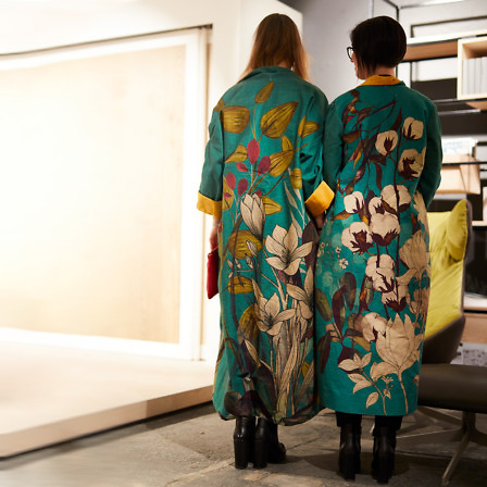
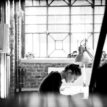
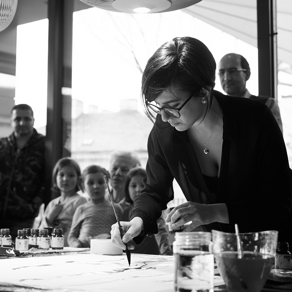
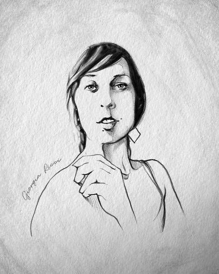
Marta and Anna, an indissoluble artistic couple, who almost think as one, with a highy-ironic tone of voice and a light and evocative design style.
They don’t lie: the way from the sketchbook to the wall was long, tortuous, a bit traumatic perhaps:
“We’d like to say: in a completely spontaneous and natural way. But we’d be lying.”
The truth is that it is neither a simple nor immediate step what Inkiostro Bianco requested to the designers who cooperated in the creation of the Sketchbook collection. The proposal was challenging, but sometimes the uphill roads are the most exciting ones and bring unexpected results.
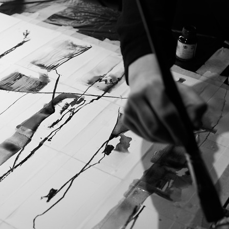
The notebook, in fact, is a personal space where you give free rein to your imagination without fear of feeling judged nor any restraint. Its pages can host the next Netflix series to watch, famous quotations, swear words, art exhibitions to see, and so on. The wall, on the contrary, is a completely different playground.
“The notebook doesn’t judge you, but the wall does. A lot. It’s a question of size. And visibility. I don’t know if you’ve ever tried to put a wall in your backpack. Well, it’s not working.”
When you think about it, bringing your sketches, clippings, thoughts on a wall can actually be considered an act of courage.
For this Inkiostro Bianco collection the two “cuttlefish designers” have freely improvised on the theme of the four seasons, which in its apparent simplicity has proved surprising even for themselves.
“Working a lot in the fashion industry, we often find divide the year into spring/summer and autumn/winter and living the seasons before they even begin. In fashion, everything is done well in advance, so in January, while it’s freezing outside, we’re indoor painting flamingos. With the Sketchbook collection we’ve given our interpretation of the Four Seasons, freeing ourselves from all schemes and conventions”.
You only need to look at their graphic designs to understand what they mean. Their four seasons mix different scenarios creating for each one an articulated universe, in which sensations overlap to create a synaesthesia.
Each graphic design is a poem in which a whole world of images, chromatic contrasts, chords and memories intertwine in an indissoluble way creating real symphonies. Contrasts of shapes, techniques, movements come to life on the walls, and the most surprising thing is how these two designers are always able to find the right harmony to express their vision of what surrounds them.
“When we illustrate a subject, we transform our interpretation of what we see into visual elements. And we do it together, with four hands, and it is surprising. Let’s face it, it really is.”
Illustrating for them means interpreting and transforming, thus creating visual emotions.